I was tasked with designing a series of infographics that communicate key insights about Bleacher Report’s content consumers. Each audience segment represents a distinct persona, and the goal was to make these groups instantly recognizable at a glance.
The challenge was to strike a balance between clarity and simplicity—avoiding overly specific physical traits while incorporating just enough visual cues to clearly differentiate each consumer type. The result is a cohesive system of characters that quickly conveys audience insights in an engaging and accessible way.
JBL Audio was looking for a bold new way to promote their product to professional athletes, and I executed this by means of a custom seeding kits and seeding cards.
The seeding kits were distributed to every team in the NBA—reaching players, coaches, and staff—as well as other high-profile athletes. Designed as more than just product shipments, these kits were intended to spark organic promotion, encouraging recipients to share the experience and showcase JBL products across their personal platforms.
Building on JBL’s pride in its iconic “horn,” the 70th anniversary initiative aimed to elevate the seeding experience beyond previous iterations. Pushing the concept further, I reimagined the horn form as a sculptural display stand for a custom pair of platinum JBL Everest Elite 300. This one-of-a-kind piece functioned as both packaging and product display—transforming the kit into a lasting, visually striking object that extended beyond its initial unboxing moment.
With a focus on luxury and premium feel, we crafted a presentation box to house an exclusive black and gold edition of the JBL Everest Elite 300, developed specifically for this kit. The experience was completed with JBL earbuds and a refined, personalized seeding card—offering an acknowledgment of an exceptional season and elevating the unboxing into a moment of recognition and prestige.
I also designed a range of seeding cards sent alongside JBL products to athletes and high-profile personalities across the NBA, WNBA, and beyond. Each card was thoughtfully tailored—some taking a sport-specific approach, others drawing on music and product cues—to create a more personal and contextually relevant brand touchpoint.
JBL then teamed up with the video game, NBA2k18, to bring the player the ability to choose, purchase and wear a variety of custom headphones in the game. The collection included a variety of designs spanning bold colorways to patterned executions inspired by themes ranging from foods, textures and patterns.
Wayback Burgers had an established presence in the fast-casual space, but its advertising lacked the same level of impact. The objective was to elevate the brand through stronger food promotions—both in-store and across external channels—while increasing brand awareness, building partnerships, and expanding its social media presence.
I developed a range of design assets to support this effort, creating visuals that reflect the brand’s nostalgic take on classic American comfort food while maintaining a fresh, contemporary feel. Drawing from vintage Americana, I incorporated bold typography, classic color palettes, and playful graphic elements to evoke a sense of familiarity and comfort—refined to feel modern and adaptable across multiple touchpoints.
This approach came to life through an expanded system of print and digital signage, promoting campaigns, menu items, merchandise, and the brand as a whole. The result is a cohesive and elevated visual identity that strengthens Wayback Burgers’ presence, bridging past and present to create a more engaging and memorable customer experience.
Can we go eat now? All this talk about burgers is making me hungry.
CHALLENGE:
PepsiCo was introducing Starry, a refreshing new lemon-lime soft drink to food service accounts. Since Starry was so recent it had zero awareness with our Gen-Z target. We had to educate restaurant-goers about Starry’s vibrant flavor profile and put it on the map.
INSIGHT:
Gen Z is a generation that has inherited a world on fire. They deal with many daily stresses and look for brands to help them blow off steam. A favorite escape? Gaming. In fact, 95% of Gen Z are gamers. So, what if we could showcase Starry’s refreshing flavor by gamifying it?
IDEA:
Inspired by Candy Crush, a favorite with Gen-Z, we dropped Starry Squeeze. Bursting with juicy lemons, limes and sparkling ice cubes, it brightened their day and showcased the drink that “hits different.” Just scan the POS and guests could play for awesome Starry prizes like coolers and bomber jackets and other Starry swag. They could also instantly share their score on social to invite friends to play.
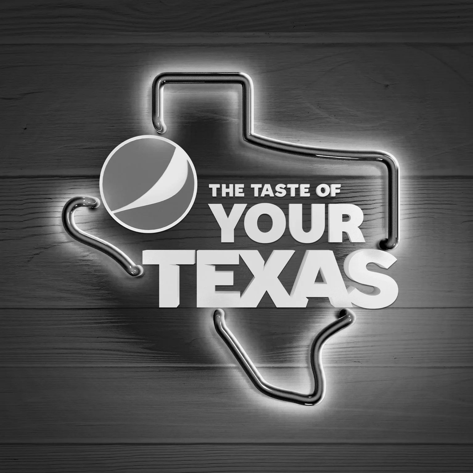
Everything is bigger in Texas, especially state pride. The Taste of Your Texas program is back and bigger and better than ever. Our job was to wrangle up sales for Pepsi at restaurants by creating an authentic connection with Lone Star locals.
Introducing Cups For Y’all by Pepsi. To capture the passion of Texans, we created a line of collectible city-themed glasses that only a true Texan could appreciate, featuring 4 major Texas cities: Houston, Dallas, Austin and San Antonio. Glasses covered in city icons like the Pegasus of Dallas and the road runners of San Antonio, our Cups For Y’all program was filled to the brim with local pride. We made it simple for our valued customers to grab one. All they had to do was order a Pepsi, scan the POS, and they could have their favorite city-glass sent directly to their homes. The program was a massive success, with a noticeable surge in Pepsi sales during this program, and had consumers trying to collect them all!
Sono 1420 is a craft distillery based in South Norwalk, Connecticut, known for carving out a distinctive niche in the spirits market. Their signature Bourbon (BRBN) and Rye are uniquely distilled using hemp seeds, setting them apart through both process and flavor profile.
The name “Sono 1420” draws inspiration from the 14th and 20th Amendments, referencing the historical arc of Prohibition and its repeal. This concept extends into the brand’s visual identity, where thoughtful details reinforce the story with, the hemp-based rope tied around each bottle and subtle design cues that nod to the “420” connection. Together, these elements create a cohesive brand that blends heritage, craft, and modern cultural references.
I’ve been fortunate to work with brands like Volkswagen, where I’ve been able to bring creative ideas to life across a wide range of events, campaigns, and activations—balancing strong brand systems with fast-moving, real-world applications.
One of the more memorable projects was a holiday activation where Volkswagen teamed up with Santa and his elves in a mall environment. I was tasked with developing a cohesive look that blended the Volkswagen brand with a festive holiday world. From signage and vehicle window graphics to elevator wraps, tabletop decals, and on-site promo pieces, I built out a full visual system that carried through the entire experience.
Another standout was the VW “SUVW Family Tailgate” campaign, built around their SUV lineup and seasonal lifestyle positioning. I created the campaign identity and extended it across everything from on-site and off-site signage to digital ads and email blasts—making sure the system held together across every touchpoint.
Beyond large activations, I’ve also worked on a range of supporting Volkswagen creative including direct mailers, magazine ads, dealer posters, and broader dealership collateral—always focused on keeping the work consistent, engaging, and visually strong.
As Lead Art Director, I was responsible for driving all creative for Mount Southington Ski Area, owning the full visual output across both seasonal and year-round marketing. The work spanned on-site and off-site posters, tri-fold brochures, trail maps, magazine ads, web sliders, web pages, and a variety of additional brand touchpoints.
Working in a fast-paced mountain environment meant the creative had to be clear, impactful, and built for real-world conditions—whether it was on the slopes, in print, or digital.
I also helped launch and bring to life the new Mountain Room wedding venue, developing creative that expanded the brand beyond skiing into a year-round destination experience.
Sports Illustrated brought us in to develop branding and creative for the Sports Illustrated | Goldfish Sportskid of the Year activation at Barclays Center in New York. I helped shape the event identity and bring it to life across a full environmental rollout designed to engage attendees from the moment they walked in.
The creative was applied across a range of high-visibility touchpoints, including large-format welcome signage, die-cut freestanding displays, floor graphics, and a fully branded snack bar experience featuring table decals, custom tablecloths, cups, and jar graphics.
The goal was to create a cohesive, energetic environment that felt immersive, fun, and consistent across every interaction within the space.
I led the design of print and digital event collateral for the LPGA Tour’s season-ending CME Group Tour Championship in Naples, Florida. The work spanned a wide range of assets created to support the event experience across both on-site environments and digital platforms.
From large-scale event pieces to supporting marketing materials, the goal was to create a cohesive system that elevated the championship atmosphere and carried consistently across every touchpoint.
Additional work that lives beyond the portfolio—showcasing range, exploration, and execution across different projects.
Logo work for a mix of clients—focused on strong marks, clear identity, and lasting impact.